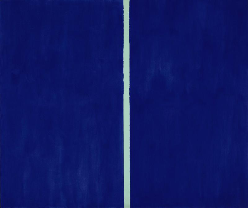
What do you think about the painting above? Some artsy-fartsy bullshit, don’t you? Then prepare to be outraged upon knowing that someone just paid 34 million euros ($ 45.07 million) for it. Mind you, New York Sotheby’s advertised it as «a portal to the sublime.» They had to be kidding, right? But if it’s just a dark blue square with a light blue stripe across. These contemporary art people are completely deluded. Come on, my little nephew could paint that picture in front of your eyes.
No, he couldn’t.
Neither my nephew nor you could paint it. Not even a competent artist without having gone through the researching creative process that led to this particular painting. Copying it, at best. At best.
It’s funny, but we often feel a deep annoyance about the money for some artwork is sold, especially the abstract ones. But therein lies one of the main problems: the value or importance of an art object couldn’t –and mustn’t- be compared to its market price. This is an intellectual aberration and a mistake on the approaching basis, because the criteria governing art market are absolutely different from those of the artistic quality. In fact, they usually are completely independent and move closer to those of stock market or real estate speculation.
Furthermore, the same outrage we feel doesn’t seem to be as strong when knowing, for example, that Real Madrid paid 96 million euros for Cristiano Ronaldo. You’ll surely say that Ronaldo is a special person, a unique player; he throws knuckleballs with his feet, runs like a sprinter and has skills that are almost otherwordly. In short, he does things the common mortal can only dream about.
Well, let me put another case in point:
Easy to copy, impossible to do. Guti, with a very simple backheel, turns a 1 on 1 into a 1 on zero. He does something that nobody has done before, something that no one has even dared to think before. He pushes the limits of football; he pushes the edges of his world.
With a very simple backheel.
Because that’s exactly what this whole art thing is about: pushing the edges of the world. And art has thousands definitions: that of Thomas Aquinas («Art is the right ordering of reason»), Adolf Loos («Art is the freedom of genius»), or Jean Dubuffet («Art is novelty»), but I don’t know which one is the most valid, or if they all are. Nor do I know whether to raise something to the category of «art» indeed raises it; that is, if an art object is inherently better than a mundane one. I don’t even know if art and beauty, so closely united over history, are actually dependent, interdependent or independent.
What I do know is that Donald Kuspit was wrong when, in The End of Art, said «We live in passive and superficial time, the result of the dissolution of art into life.» And I also know that Clement Greenberg, although a fierce advocate of the end of art concept, was right in saying that «You like it, that’s all, whether it’s a landscape or abstract. You like it. It hits you. You don’t have to read it. “ And that Arthur Danto was also right when he refused to accept that end of art and thus, he titled his most famous essay as After the End of Art.
Maybe I’m more in line with the Greenberg objectual approach than Danto’s one, who somehow justified artistic quality just by being made by an artist; but I’m totally in for his optimistic view of present art. Because I know there are many people who look at reality, with surgical and telescopic eyes, and then offer a response to that reality, being conceptual, plastic, aesthetic or subversive. And the world that we have in return is a world we didn’t know before.
Because that’s exactly what this whole art thing is about: pushing the edges of the world.
Because although it’s true that we need all those people who keep the world in motion, supervising the machinery and repairing the gears; we also need engines to lead us. And to lead us further. Sometimes accurately, sometimes blindly, but always by unknown routes. For these men and women who are expanding our reality; through their wire meshes and their computers and wood pieces and plastic bags and jewelry and cameras. Through their eyes. Approaching them, we see they are building a larger existence, a better existence. And without them pushing in all directions, the circus tent that is the world would be falling all over us.
I’m going to show you some works by artists who now, at this very moment -as I write these lines and you read them- are pushing the edges of the world. Your world and my world. I won’t describe creative processes or possible metaphors hide in them, just a brief description of the works and their creators, so you can draw your own conclusions, if you think there are any. I have only one request: come with the experience –now is the time- of a little kid, with the eyes of a toddler who discovers the world every day. With clear eyes and full hearts, you can’t lose.
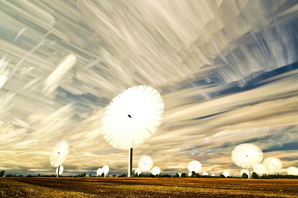
Time Stack. Matt Molloy. 2012-2013
Canadian photographer Matt Molloy uses a really simple technique based on the well-known multi-shot and time-lapse effect. He then digitally superimposes the taken images -often more than 100-, capturing that time stacked impression which is the name of this picture series. The impact generated upon viewing inherently mobile objects, frozen in time over static landscapes, is equally haunting and formidable.
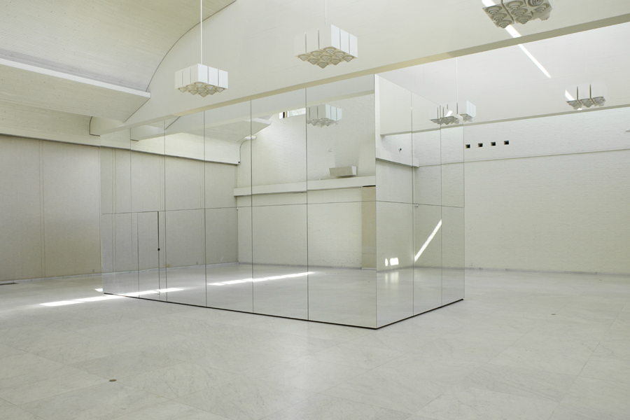
The Phoenix is closer than it appears. Thilo Frank. 2010
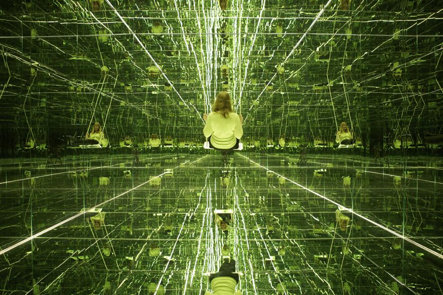
German artist based in Berlin Thilo Frank works regularly with light, movement, and their properties combined. For this installation, he built an 8 x 4 x 4m box entirely mirror-covered both outside and inside. Outside it hardly exists, is a blink, an almost invisible vibration. Inside is the infinite. And yet, we find this infinite, our feet dangling off the swing, as unfathomable as unreachable.
The installation premiered in the KUNSTEN Museum of Modern Art in Denmark in 2011, although this year he has presented a similar work in the Biennial of Sharjah in the UAE: the Infinity Rock.
Starry Night. Lee Eunyeol. 2012
What is that? What are these lights? Is it fairy dust? Maybe fallen stars? Are they countless fireflies sheltering from the desert heat?
They are LED lamps and fiber optic wire in between a dry riverbed cracks. But maybe it’s also everything else and all that we can evoke but cannot verbalize. South Korean photographer Lee Eunyeol calls this series Starry Night and he makes none of the analogies, somewhat naive, I just did. Maybe they’re not necessary.
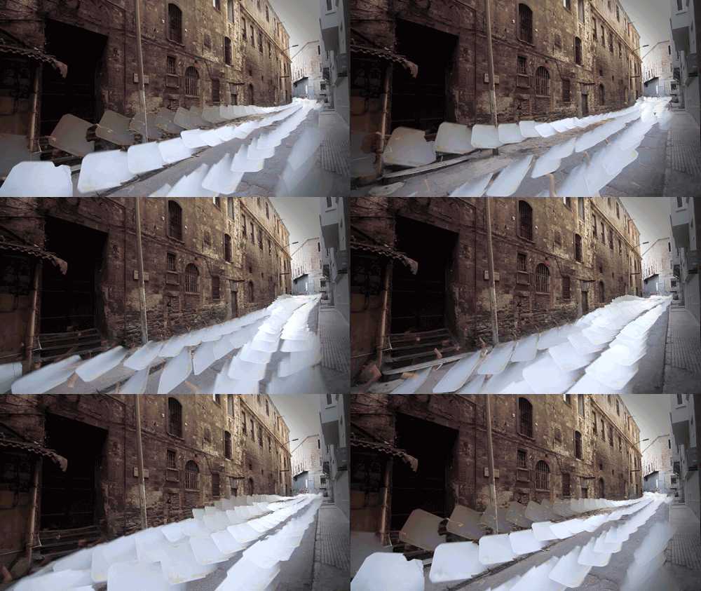
Clones. Erdal Inci. 2013.
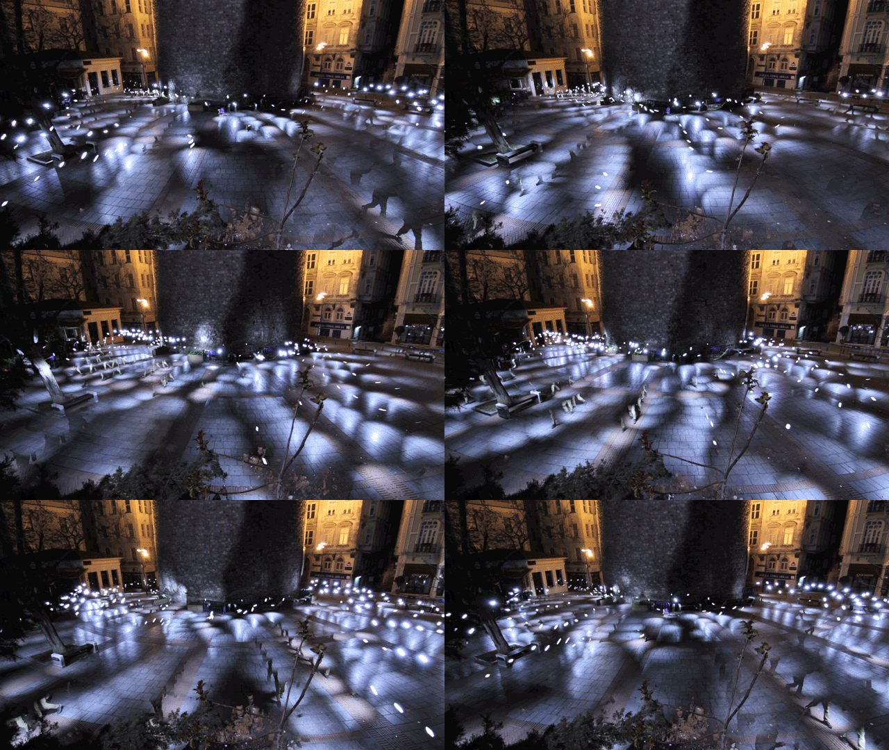
Like Matt Molloy, Erdal Inci works on the possibilities of time-lapse. However, the medium used by the Turkish artist is different, new and largely unexplored: the animated gif.
Exactly, the artwork is the moving image you are seeing. It’s not a summary, is literally what it is. Don’t know about you, but I have the overwhelming feeling of witnessing the birth of something potentially colossal, a world of endless possibilities, through the curious eyes of a delicate, neat and extremely accurate creator.
For the Clones series, Inci merges and juxtaposes dozens of micro-videos in an eternal loop, transforming mundane situations and landmarks -squares, parks, roads- into hypnotic and mysterious spaces.
Obliteration Room. Yayoi Kusama. 2002-2012
Now is the time. The Obliteration Room could be made by my seven year old nephew, and my three year old niece, and my eleven year old cousin. And by you or me. Because it’s precisely made by children of all ages, including children of adult ages. At least in part.
Japanese artist Yayoi Kusama doesn’t conceive this work as a finished object, but as a collaborative entity of uncertain outcome. That’s why I find more interesting to show you the process video than the final photographs. In it we see as this impossibly white room is gradually shifting to some space even more impossible. Visitors were given various colored stickers to be freely placed anywhere in the room. Anywhere they wished: walls, floors, ceilings, furniture, cups, pillows. The video was shot at the London Tate Modern in 2012, but the installation premiered for the Queensland Art Gallery in 2002, and then visitors were only children.
It’s funny to know that Kusama is the artist in this article more concerned about children, especially when realizing she has just turned 84. The eyes don’t know about age; only know how to be closed. Or open.
One Hundred and Eight. Nils Völker. 2010
Indeed, this work consists of 108 plastic trash bags connected to 108 cooling fans on a 12 x 9 matrix. Computer algorithms enable these fans generating a wobbling fluctuation in the bags through their inflation and deflation process, thus giving life to a shape-shifting pulmonary alien proto-creature. In its description, the German artist Nils Völker said: «There’s no message, I just think it’s very cool.»
The author himself made a new version in which a sensor system activated the fans depending on the proximity or movement of the viewer. The result is something more intellectual, but it seems a little less “cool” to me.
Compeshitstem: The New Deal. Phoebe Washburn. 2009
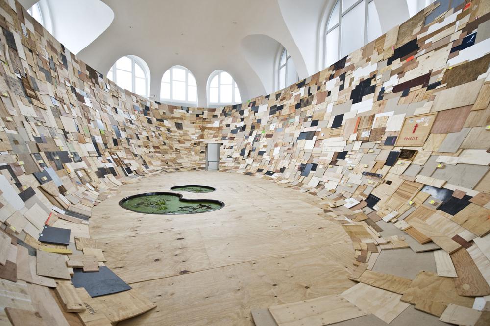
On the contrary, American sculptor Phoebe Washburn always gives a deep sociological content to her works, often citing the environmental transformation by the destructive action of man. To this end, she often uses everyday and even waste objects, which are freely reused, creating some kind of rough ephemeral architectures. Packing boxes, planks, plastic bottles, stones and tubes are arranged into floors and walls which become both rugged and intensely talkative.
However, I’m more interested in the final artistic product and the physical process of its construction, since Washburn installations are conceived and built precisely for the exhibition rooms in which they are to be shown. Compeshitstem: The New Deal was created for one of the most interesting rooms in the Hannover Kestnergesellschaft, and this video shows both the evolution of its setting-up and the light changes on the installation, as the sun moved through daytime.
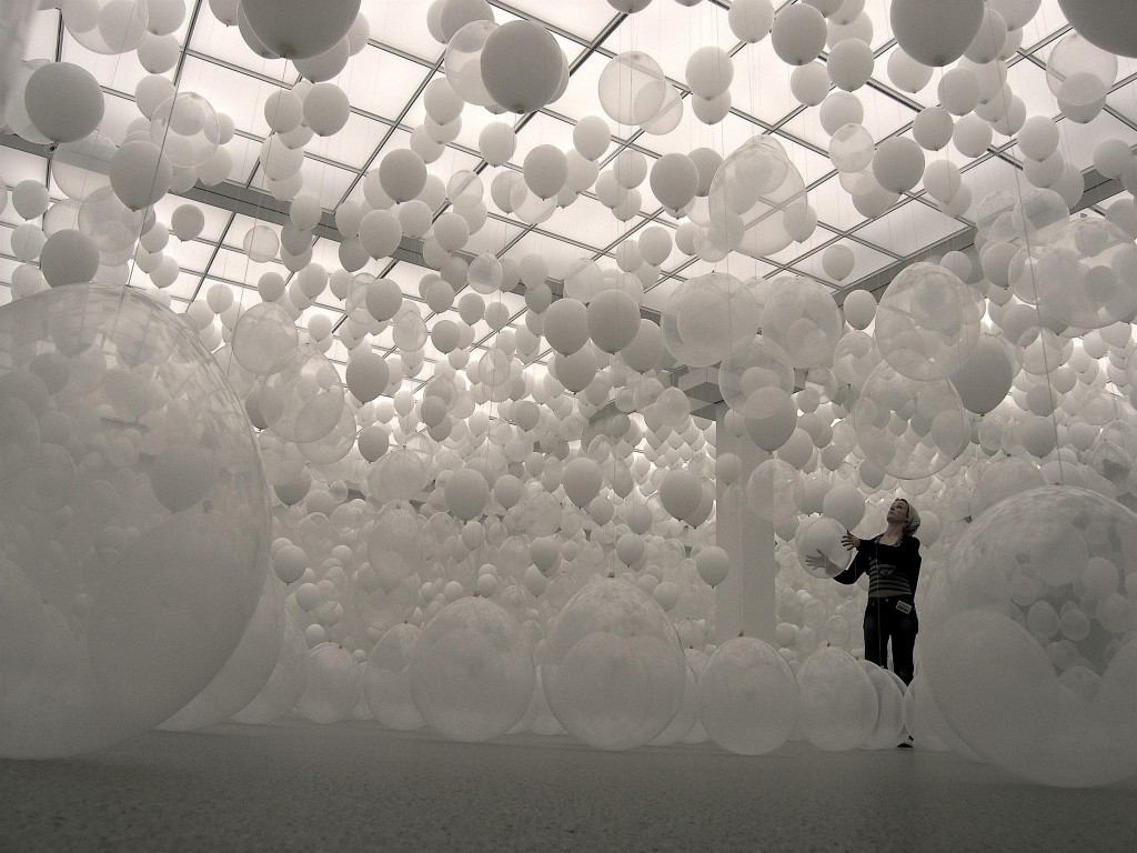
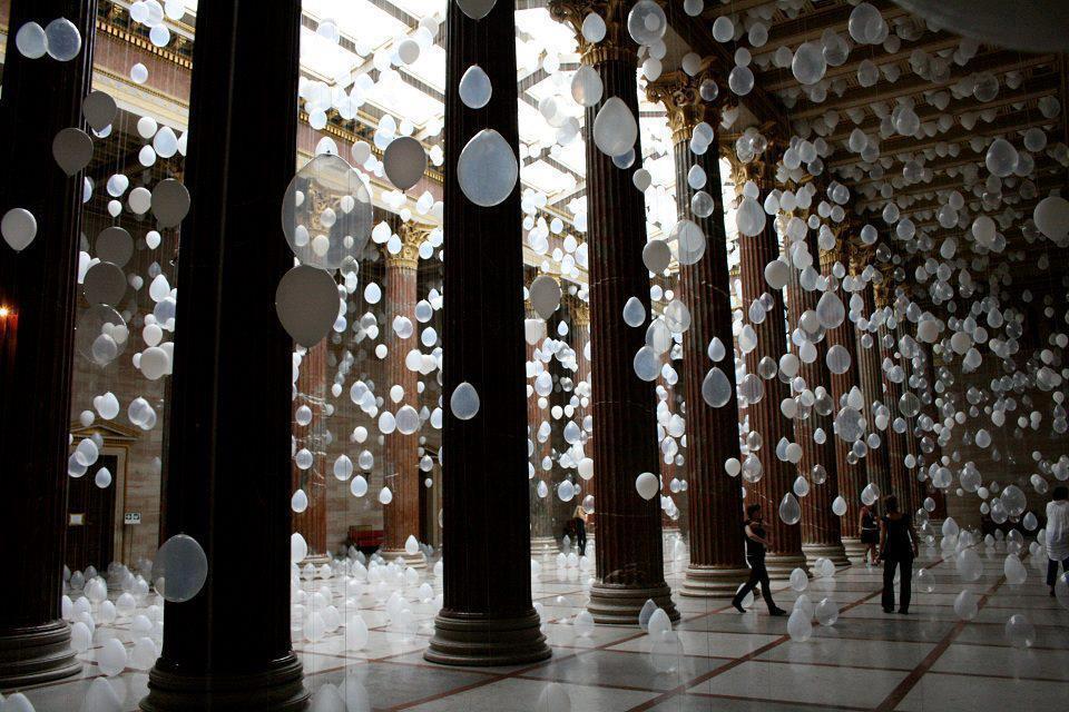
Scattered Crowd. William Forsythe. 2002-2013
William Forsythe is a dancer and choreographer, and among his works there’s a section called Choreographic Objects. Scattered Crowd is one of the most significant: thousands of white balloons hanging at different heights that can -and should- be walked by, touched and seen through their caesuras and between spaces.
This installation has been traveling the world for the last ten years, from art galleries to train stations and hotel lobbies. The photos do the work visual justice, no doubt, but I think it’s necessary to be walking by the installation itself to truly understand its sensory experience. Or at least watch this video which, among other things, includes the music Ekkehard Ehlers composed especially for it.
Cloud. Caitlind r.c. Brown y Wayne Garrett. 2012
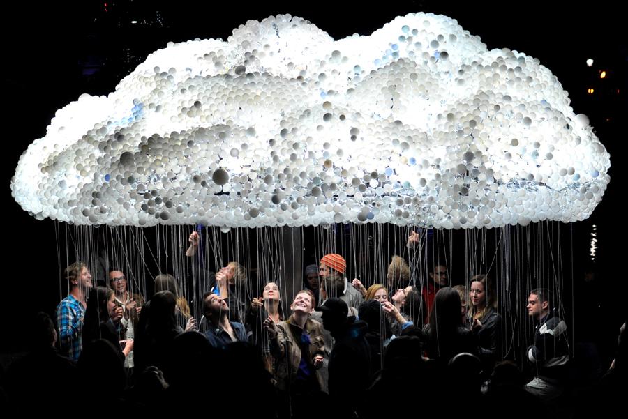
A cloud built with hundreds of bulbs. New and used, broken and running. And visitors pull the hanging strings to turn them on and off. To play in an impossible, though funny, shower.
Canadian artists Caitlind r. c. Brown and Wayne Garrett premiered this installation for the Calgary «Nuit Blanche», but later versions have done the same in Moscow and inside the Progress Bar in Chicago, where they replace the strings for a few motion detectors which recognize the visitor who walks by, sits or have a beer below it.
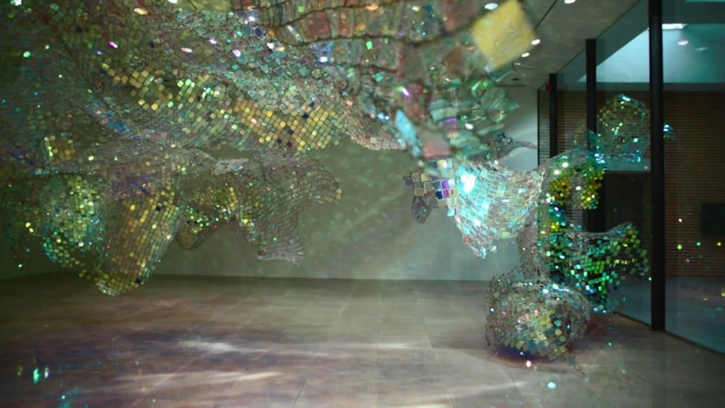
Unwoven Light. Soo Sunny Park. 2013
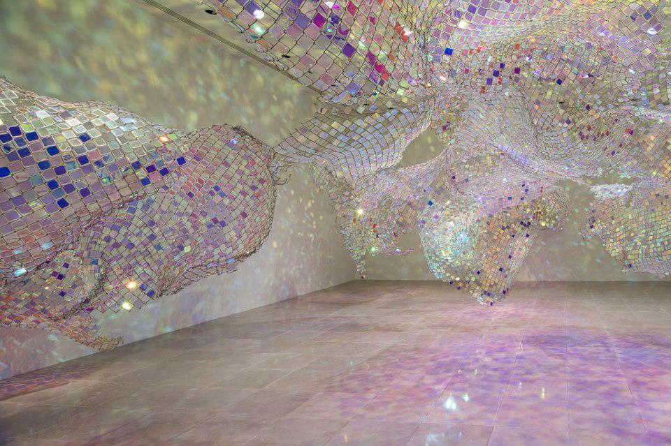
Soo Sunny Park has always worked with space. By adding objects and surfaces, the South Korean sculptor based in the USA explores the space transformation possibilities without any physical modification of such space. With no need to touch it.
In Unwoven Light she reveals one of the most powerful entities when executing this spatial alteration. It is the light, of course. The installation is merely some folded wire mesh, with small pieces of colored, translucent methacrylate sewn to it. But it’s the light, the electric photons from the gallery spotlights, impassive and hermetic before, which, passing through such multichrome strainer, are filtered and unwoven and shoot in all directions, pushing the space, and maybe the world, irreversibly.
Now get close to them, don’t be afraid:
Matt Molloy (http://500px.com/MattMolloy)
Thilo Frank (http://www.thilofrank.net/)
Lee Eunyeol (http://www.thisiscolossal.com/2012/04/starry-night-light-installations-by-lee-eunyeol/ )
Erdal Inci (http://erdalinci.tumblr.com/)
Yayoi Kusama (http://www.yayoi-kusama.jp/e/information/index.html)
Nils Völker (http://www.nilsvoelker.com/)
Phoebe Washburn (http://www.zachfeuer.com/artists/phoebe-washburn/)
William Forsythe (http://www.williamforsythe.de/)
Caitlind r.c. Brown y Wayne Garrett (http://incandescentcloud.com/)
Soo Sunny Park (http://soosunnypark.com/)










Pingback: ¡Han pagado 34 millones de euros por un cuadro abstracto! Y otras obras de arte que podría hacer mi sobrino de siete años
If you have read it, what do you think about this book http://www.goodreads.com/book/show/15929764-what-are-you-looking-at ?
For a me it was amazing to discover the purpose of many paintings, sculptures or performances. Even I enjoyed some of them. After discovering Cut Piece, I will never look Yoko Ono with the same contempt.
I haven’t read it, but it surely seems pretty interesting.
I’ll check it out as soon as possible.
Thanks and regards.
There is a fundamental difference between ‘Onament VI’ and the other examples (including the football backheel) – it’s not clever and it doesn’t look like much effort was put into it.
As such the other examples don’t look like they were made by a seven year old, even if they could have been.
That’s probably the part that enrages people, myself included.
I’m not totally sold on that «effort» concept. I mean, Inci’s or Soo Sunny Park’s works are made with clearly lost of effort, but do you really think is that much «effort» in the Scattered Crowd by Forsythe or the mirrored room by Thilo Frank?
Regards.
I wanted to say «lots of effort» and not «lost of effort».
My bad.
I mean, the effort is clear in every example, but it’s not necessarily «physical» effort.
No of course not, I wasn’t implying the effort is physical, more along the lines of that it’s creative and thought was put into either the execution or preparation and seems like more action was involved.
I’m not saying Onement VI was done in 15 minutes spontaneously with ‘no fucks given’, but that’s what it looks like, certainly compared to the other examples.
I mean there’s a reason people are angry that such paintings make so much money, I’d say this is it – they don’t see the effort, visual appeal or creativity behind it and hence don’t see why it would be so valuable.